Custom Code Blocks with MDX & Gatsby
November 02, 2021
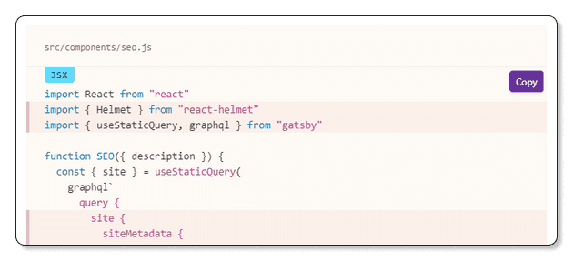
If you’ve recently integrated MDX into your blog, you may be looking to add a few new custom and interactive elements to your posts. A great feature to start working on is an enhanced custom code block with better functionality and visual appeal. If your site is built using Gatsby, you’ve likely seen their documentation with these wonderful code examples:
In addition to syntax highlighting, their code block component displays the file location, a programming language label, individual line highlighting and also comes with a handy-dandy copy button to save you the hassle of selecting the code and pressing a keyboard shortcut. This guide will show you how to make your own custom code block component for your Gatsby site, but the general strategy is applicable to any React-based framework with a few tweaks and changes.
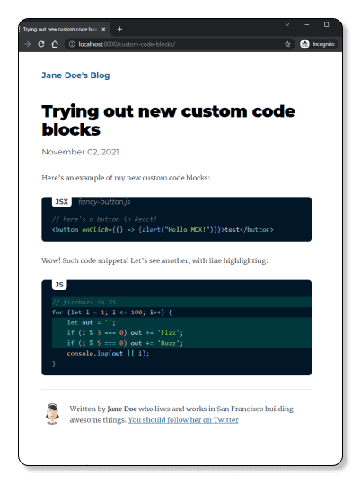
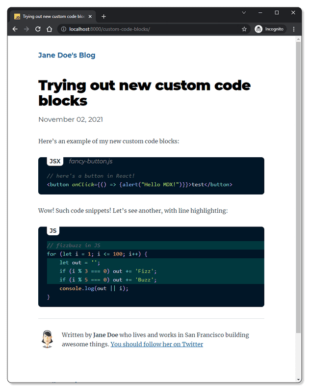
Here’s an example of where this guide will take you:
Prerequisites
To follow along with this guide, you’re going to need a Gatsby project that’s been set up to programmatically create pages and posts from MDX files. I’ve written about getting started with Gatsby and adding MDX to your website, so go check those out if you need to catch up.
The code in this guide lives in this GitHub repo if you ever want to reference back to it.
It’s good to make sure you have a high level understanding of the way MDX takes the code blocks you write in Markdown and transforms them into HTML. Here’s how you would write an example code snippet in Markdown:
```jsx// here's a button in React!<buttononClick={() => {alert("Hello MDX!");}}>test</button>```
In Markdown syntax, a fenced code block is created by wrapping example code snippets in the three backticks (```). The first line in a fenced code block is parsed as a metadata string. After the first set of backticks you would include the programming language name, followed by key-value pairs of additional information (such as the file location where your code snippet should be placed).
The rendering of basic elements written in Markdown (such as headings H1, H2 etc, paragraphs, links, images, and code blocks) is done using default HTML elements. For example, level 2 headings written in Markdown are rendered using <h2> tags, while a fenced code block is translated into HTML using <pre><code> tags.
Take this example written in Markdown:
## An example code snippet```js file=src/components/button.js// code snippet```
And the resulting HTML:
<h2>An example code snippet</h2><pre><code><!--- code snippet ---></code></pre>
MDX extends the Markdown language by allowing you to a). render components in-line, in addition to the basic elements supported by Markdown and b). remap said basic elements to your own custom components. Rendering components in-line is an out-of-the-box capability of MDX. In my previous article on migrating the Gatsby default blog starter from MD to MDX, I showed an example for adding a <button> component in-line within your .mdx file.
Wow! Such button!<button onClick={() => {alert("Hello MDX!")}}>test</button>
Unlike the simplicity of using components in-line, remapping basic elements to custom components takes a bit of configuration and setup. To control the rendering of these elements with your own components, MDX provides a components object. The components object is a mapping between the HTML name and the desired component you’d like to render. In the following example taken from the MDX documentation, the default H1 is overridden:
// src/App.jsimport React from "react";import Hello from "../hello.mdx";const MyH1 = props => <h1 style={{ color: "tomato" }} {...props} />;const components = {h1: MyH1,};export default () => <Hello components={components} />;
In a production site, you’re likely to be using an app layout that wraps the entire site application. To pass components in one place you can use MDXProvider, which is a component that you can place anywhere higher than your MDXContent in the React tree. Using the Context API, MDXProvider will pass a list of the components that you want to override to MDXContent.
The preferred pattern to achieve this in a Gatsby application is to use wrapRootElement. Gatsby provides the wrapRootElement API to set up any Provider component to wrap the entire application. The wrapRootElement is available as both a Gatsby browser API (via gatsby-browser.js) and Gatsby Server Rendering API (via gatsby-ssr.js). You must implement the same component in both gatsby-ssr.js and gatsby-browser.js so that pages generated through SSR are the same after being hydrated in the browser. If you’re new to Gatsby and this sounds a bit too complicated, then rest assured that it’s one of those things that just clicks after working through an example.
Getting Started
It’s time to get your hands dirty.
Open (or create) the gatsby-browser.js file in the root of your Gatsby project.
Then import the React flavour of MDXProvider and use it to map the custom component to code blocks by replacing the default <pre> and <code> tags.
import React from "react";import { MDXProvider } from "@mdx-js/react";const components = {pre: props => <div {...props} />,code: props => <pre style={{ color: "pink" }} {...props} />,};
Finally, use the wrapRootElement API to set up the MDXProvider:
export const wrapRootElement = ({ element }) => {return <MDXProvider components={components}>{element}</MDXProvider>;};
Your gatsby-browser.js should look like this:
// other import statements for styling etc.import React from "react";import { MDXProvider } from "@mdx-js/react";const components = {pre: props => <div {...props} />,code: props => <pre style={{ color: "pink" }} {...props} />,};export const wrapRootElement = ({ element }) => {return <MDXProvider components={components}>{element}</MDXProvider>;};
Create a test blog post and add some code blocks to test your new custom component. Here is mine:
---title: Trying out new custom code blocksdate: "2021-11-02"description: "A great way to display your code snippets on your MDX+Gatsby blog."---Here's an example of my new custom code blocks:```jsx// here's a button in React!<buttononClick={() => {alert("Hello MDX!");}}>test</button>```Wow! Such code snippets!Let's see another, with line highlighting:```js// fizzbuzz in JSfor (let i = 1; i <= 100; i++) {let out = "";if (i % 3 === 0) out += "Fizz";if (i % 5 === 0) out += "Buzz";console.log(out || i);}```
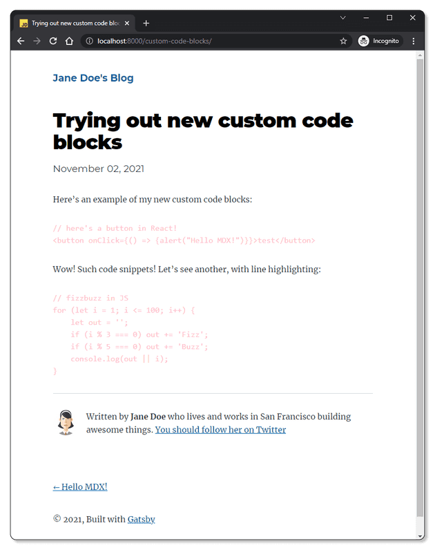
Save your work and restart your development sever. Your code blocks should now show up in glorious pink:
With basic setup out of the way, the first feature you’re going to enable is syntax highlighting using the prism-react-renderer package.
Adding syntax highlighting
There are two ways of adding syntax highlighting with MDX: with composition (via the MDXProvider) and by using a remark plugin. If you’re migrating a project previously set up using Remark, you may already have the gatsby-remark-prismjs (or similar) plugin to add syntax highlighting with PrismJS (in fact, if you commented out the styling import in gatsby-browser.js, you can uncomment it and see that it applies styling to the code blocks; then remember to comment it out again or delete it).
However, this approach won’t work for the custom code block we’re building (the plugin will interfere with some of the string parsing methods needed to access the code fence metadata). You will need to migrate to an alternative highlighter for React elements (the MDX maintainers recommend prism-react-renderer). So go ahead and uninstall and remove gatsby-remark-prismjs from the gatsby-config.js file:
{resolve: `gatsby-plugin-mdx`,options: {extensions: [`.mdx`, `.md`],gatsbyRemarkPlugins: [{resolve: `gatsby-remark-images`,options: {maxWidth: 630,},},{resolve: `gatsby-remark-responsive-iframe`,options: {wrapperStyle: `margin-bottom: 1.0725rem`,},},- `gatsby-remark-prismjs`,`gatsby-remark-copy-linked-files`,`gatsby-remark-smartypants`,],},},
Then install prism-react-renderer by using the following command in your terminal:
npm install --save prism-react-renderer
<Highlight /> is the only component exposed by this package. You can read more about it in their documentation. Add the import at the top of your gatsby-browser.js file:
import React from "react";import { MDXProvider } from "@mdx-js/react";import Highlight, { defaultProps } from "prism-react-renderer";
Return to your components object and replace its contents with the following, which is based on the example from the MDX docs:
const components = {pre: props => {console.log(props);const className = props.children.props.className || "";const code = props.children.props.children.trim();const language = className.replace(/language-/, "");return (<Highlight {...defaultProps} code={code} language={language}>{({ className, style, tokens, getLineProps, getTokenProps }) => (<pre className={className} style={style}>{tokens.map((line, i) => (<div {...getLineProps({ line, key: i })}>{line.map((token, key) => (<span {...getTokenProps({ token, key })} />))}</div>))}</pre>)}</Highlight>);},};
When using an MDX file in source pages in a Gatsby project, you may see an invalid prop warning in the console. This is because MDX content has a root element called wrapper which is a React.Fragment. Gatsby will pass in any page context to the page component as props, but React.Fragment cannot take any props. To fix this, you can replace wrapper with a fragment, but not pass in any props. Add the following to your components object:
const components = {pre: props => {console.log(props);const className = props.children.props.className || "";const code = props.children.props.children.trim();const language = className.replace(/language-/, "");return (<Highlight {...defaultProps} code={code} language={language}>{({ className, style, tokens, getLineProps, getTokenProps }) => (<pre className={className} style={style}>{tokens.map((line, i) => (<div {...getLineProps({ line, key: i })}>{line.map((token, key) => (<span {...getTokenProps({ token, key })} />))}</div>))}</pre>)}</Highlight>);},wrapper: ({ children }) => <>{children}</>,};
At this point, your gatsby-browser.js should look like this:
import React from "react";import { MDXProvider } from "@mdx-js/react";import Highlight, { defaultProps } from "prism-react-renderer";// Other imports for styling etc.const components = {pre: props => {console.log(props);const className = props.children.props.className || "";const code = props.children.props.children.trim();const language = className.replace(/language-/, "");return (<Highlight {...defaultProps} code={code} language={language}>{({ className, style, tokens, getLineProps, getTokenProps }) => (<pre className={className} style={style}>{tokens.map((line, i) => (<div {...getLineProps({ line, key: i })}>{line.map((token, key) => (<span {...getTokenProps({ token, key })} />))}</div>))}</pre>)}</Highlight>);},wrapper: ({ children }) => <>{children}</>,};export const wrapRootElement = ({ element }) => {return <MDXProvider components={components}>{element}</MDXProvider>;};
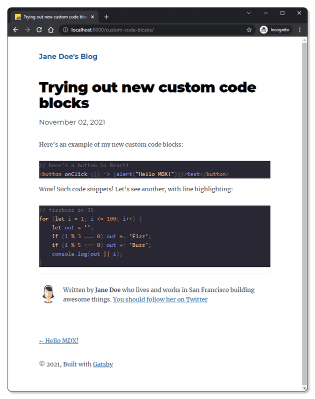
Test out your new component by running gatsby develop in the console and checking the test blog post. You should now have syntax highlighting for your code blocks.
The default theme for syntax highlighting is Duotone Dark, but you can import a different one that comes bundled with ‘prism-react-renderer’, use your own theme, or even convert Prism’s css themes. I’ll follow the documentation to add Sarah Drasner’s NightOwl theme, which is the one I’m currently using for my IDE as well.
//add the import at the top of the fileimport theme from "prism-react-renderer/themes/nightOwl"//then pass it as a prop to the <Highlight /> component<Highlight {...defaultProps} code={code} language={language} theme={theme} >
Understand your code and add language and file labels
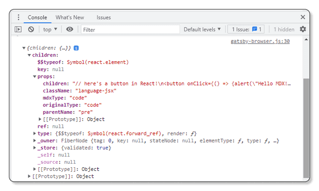
There’s a lot going on in this component, so I’ve included a console.log() expression to show the props we’re getting for the <pre> tag from the MDXProvider. Take a look at the output in your browser’s debug console so that you can better understand how the <Highlight /> component works.
Remember that a fenced code block is translated into HTML using <pre><code> tags. From logging out the props you’ll see that the object has a “children” key. If you expand the children, you’ll see that the child element for the pre tag is a code element (props.children.props.mdxType: "code"). The className reveals the programming language (props.children.props.className: "language-jsx"), while the code snippet itself comes via this element’s children prop (props.children.props.children: "// here's a button in React! [...]"). Try adding some additional metadata to your blog post code fence. Suppose the code snippet is from a file fancy-button.js:
```jsx file=fancy-button.js// here's a button in React!<buttononClick={() => {alert("Hello MDX!");}}>test</button>```
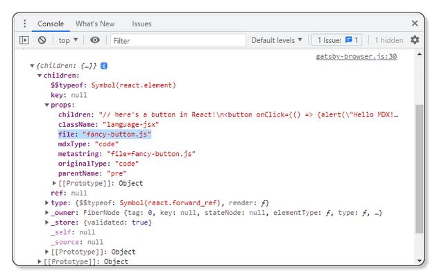
Save your work and refresh your browser page, then check out the props being logged:
By including file=fancy-button.js in the first line of the code fence, you have defined a new key-value pair of additional information (the file location where your code snippet should be placed). The “file” prop is created and passed automatically by MDX. Using this strategy, you can create any number of props to enhance your custom code blocks.
To display the language just above the code block, place a new <div> inside the <pre> element in the <Highlight />.
<div>{`Language: ${language}`}</div>
To show the file location as well, first pull the information off the props object:
const file = props.children.props.file;
Then conditionally render it inside another div (if you don’t include a file location in your code fence, the div will render empty):
<div>{file && `File: ${file}`}</div>
Here’s this section’s finished code for gatsby-browser.js:
import React from "react";import { MDXProvider } from "@mdx-js/react";import Highlight, { defaultProps } from "prism-react-renderer";import theme from "prism-react-renderer/themes/nightOwl";// Other styling importsconst components = {pre: props => {console.log(props);const className = props.children.props.className || "";const code = props.children.props.children.trim();const language = className.replace(/language-/, "");const file = props.children.props.file;return (<Highlight{...defaultProps}code={code}language={language}theme={theme}>{({ className, style, tokens, getLineProps, getTokenProps }) => (<pre className={className} style={style}><div>{`Language: ${language}`}</div>{<div>{file && `File: ${file}`}</div>}{tokens.map((line, i) => (<div {...getLineProps({ line, key: i })}>{line.map((token, key) => (<span {...getTokenProps({ token, key })} />))}</div>))}</pre>)}</Highlight>);},wrapper: ({ children }) => <>{children}</>,};export const wrapRootElement = ({ element }) => {return <MDXProvider components={components}>{element}</MDXProvider>;};
Clean up your code
Now that you have an understanding of how MDX and prism-react-renderer fit together, it’s time to separate the functionality out of the gatsby-browser.js file to maintain your codebase nice and tidy.
Create a new file named wrap-root-element.js in your components folder. Then cut out the wrapper from gatsby-browser.js and paste it into this new file:
import React from "react";import { MDXProvider } from "@mdx-js/react";import Highlight, { defaultProps } from "prism-react-renderer";import theme from "prism-react-renderer/themes/nightOwl";const components = {pre: props => {const className = props.children.props.className || "";const code = props.children.props.children.trim();const language = className.replace(/language-/, "");const file = props.children.props.file;return (<Highlight{...defaultProps}code={code}language={language}theme={theme}>{({ className, style, tokens, getLineProps, getTokenProps }) => (<pre className={className} style={style}><div>{`Language: ${language}`}</div>{<div>{file && `File: ${file}`}</div>}{tokens.map((line, i) => (<div {...getLineProps({ line, key: i })}>{line.map((token, key) => (<span {...getTokenProps({ token, key })} />))}</div>))}</pre>)}</Highlight>);},wrapper: ({ children }) => <>{children}</>,};export const wrapRootElement = ({ element }) => {return <MDXProvider components={components}>{element}</MDXProvider>;};
Now import the new component in your gatsby-browser.js:
import { wrapRootElement as wrap } from "./src/components/wrap-root-element";export const wrapRootElement = wrap;
This is a good time to remember that you need to do the same in gatsby-ssr.js:
import { wrapRootElement as wrap } from "./src/components/wrap-root-element";export const wrapRootElement = wrap;
Save and restart your development server and make sure everything is still working fine.
You should now also move the custom code block logic into its own file. Create a new file called code.js in your components folder and transfer the code block component from wrap-root-element.js:
import React from "react";import Highlight, { defaultProps } from "prism-react-renderer";import theme from "prism-react-renderer/themes/nightOwl";const Code = props => {const className = props.children.props.className || "";const code = props.children.props.children.trim();const language = className.replace(/language-/, "");const file = props.children.props.file;return (<Highlight {...defaultProps} code={code} language={language} theme={theme}>{({ className, style, tokens, getLineProps, getTokenProps }) => (<pre className={className} style={style}><div>{`Language: ${language}`}</div>{<div>{file && `File: ${file}`}</div>}{tokens.map((line, i) => (<div {...getLineProps({ line, key: i })}>{line.map((token, key) => (<span {...getTokenProps({ token, key })} />))}</div>))}</pre>)}</Highlight>);};export default Code;
Then import and use it in your wrap-root-element.js:
import React from "react";import { MDXProvider } from "@mdx-js/react";import Code from "./code";const components = {pre: props => <Code {...props} />,wrapper: ({ children }) => <>{children}</>,};export const wrapRootElement = ({ element }) => {return <MDXProvider components={components}>{element}</MDXProvider>;};
Test again to make sure your changes didn’t break anything, then open the Code file and move on to your next task!
Add line highlighting
Line highlighting allows you to draw attention to specific lines of code in your examples. We’ll use another key=value pair on the metastring in the code fence to represent which lines should be highlighted. To make things simple, you should write this in the form of an expression that can be interpreted by a numeric range parser, such as parse-numeric-range.
In your .mdx example post, add the following example code block, where the expression 1,3-5 is used to highlight lines 1, 3, 4 and 5 in your example code snippet:
```js highlights=1,3-5// fizzbuzz in JSfor (let i = 1; i <= 100; i++) {let out = "";if (i % 3 === 0) out += "Fizz";if (i % 5 === 0) out += "Buzz";console.log(out || i);}```
Make sure you don’t introduce any whitespace accidentally in your highlights expression. Then, in your code.js file, you need to write a function that takes this string and converts it into an array that includes all line numbers that you wish to highlight.
First, install your range parser.
npm install --save parse-numeric-range
Then, in your code component, import the package and pull down the raw line highlight range from the metastring, then parse it and log the outcome:
const raw = props.children.props.highlights || "";console.log(rangeParser(raw));
Check that your parser is working by looking at the output. You should see an array with all the lines that you intend to highlight:
When you’re mapping each line in your code block, you need to check weather it’s in this array. An elegant way to do this is to write a helper that returns a function that can be executed to determine if it is a line to highlight or not:
const calculateLinesToHighlight = raw => {const lineNumbers = rangeParser(raw);if (lineNumbers) {return index => lineNumbers.includes(index + 1);} else {return () => false;}};
Then assign this to a const inside your code function:
const highlights = calculateLinesToHighlight(props.children.props.highlights || "");
Finally, when you’re outputting the div that wraps each line of code, conditionally apply a background to your highlighted lines:
<div {...getLineProps({ line, key: i })}style={{background: highlights(i) ? "#00f5c426" : "transparent",display: "block",}}>
Here’s how your Code component should look like now:
import React from "react";import Highlight, { defaultProps } from "prism-react-renderer";import theme from "prism-react-renderer/themes/nightOwl";import rangeParser from "parse-numeric-range";const calculateLinesToHighlight = raw => {const lineNumbers = rangeParser(raw);if (lineNumbers) {return index => lineNumbers.includes(index + 1);} else {return () => false;}};const Code = props => {const className = props.children.props.className || "";const code = props.children.props.children.trim();const language = className.replace(/language-/, "");const file = props.children.props.file;const highlights = calculateLinesToHighlight(props.children.props.highlights || "");return (<Highlight {...defaultProps} code={code} language={language} theme={theme}>{({ className, style, tokens, getLineProps, getTokenProps }) => (<pre className={className} style={style}><div>{`Language: ${language}`}</div>{<div>{file && `File: ${file}`}</div>}{tokens.map((line, i) => (<div{...getLineProps({ line, key: i })}style={{background: highlights(i) ? "#00f5c426" : "transparent",display: "block",}}>{line.map((token, key) => (<span {...getTokenProps({ token, key })} />))}</div>))}</pre>)}</Highlight>);};export default Code;
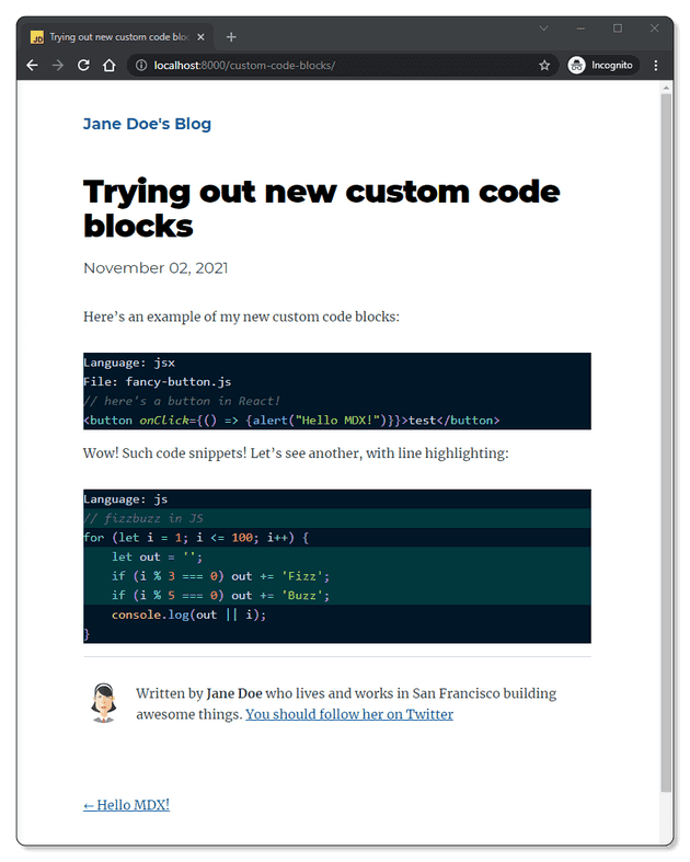
And here is the result in the browser:
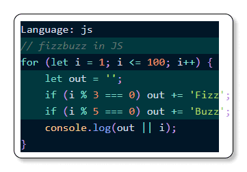
On smaller viewports though, the code extends past its container.
You’ll fix that, and make sure that the highlights extend correctly, by wrapping the <Highlight> component in a div that has overflow set to “auto”, then wrapping the entire shebang in another div with the correct background. Then you’ll add some styling to the <pre> element and code line <div>. Since you’re already dealing with a styling issue, take this opportunity to round a few corners and tidy up the title and language labels as well. Applying in-line styles is not something I would recommend, but for the purpose of this guide, it’s good for providing a working example that’s easy to translate into your preferred way of styling your React components. After adding in these changes your Code component becomes:
import React from "react";import Highlight, { defaultProps } from "prism-react-renderer";import theme from "prism-react-renderer/themes/nightOwl";import rangeParser from "parse-numeric-range";const calculateLinesToHighlight = raw => {const lineNumbers = rangeParser(raw);if (lineNumbers) {return index => lineNumbers.includes(index + 1);} else {return () => false;}};const Code = props => {const className = props.children.props.className || "";const code = props.children.props.children.trim();const language = className.replace(/language-/, "");const file = props.children.props.file;const highlights = calculateLinesToHighlight(props.children.props.highlights || "");return (<divstyle={{background: "#011627",borderRadius: "0.5rem",marginTop: "2rem",marginBottom: "2rem",paddingLeft: "1.5rem",}}><div style={{ display: "flex", position: "relative" }}><divstyle={{background: "#ffffff",marginRight: "1rem",paddingLeft: "0.5rem",paddingRight: "0.5rem",textTransform: "uppercase",borderBottomLeftRadius: "0.5rem",borderBottomRightRadius: "0.5rem",fontFamily: "Montserrat",fontWeight: "bold",textAlign: "center",display: "flex",justifyContent: "center",alignItems: "center",}}>{`${language}`}</div><divstyle={{color: "#9d9d9d",fontFamily: "Montserrat",fontStyle: "italic",display: "flex",justifyContent: "center",alignItems: "center",}}>{file && `${file}`}</div></div><divstyle={{overflow: "auto",background: "#011627",borderRadius: "0.5rem",}}><Highlight{...defaultProps}code={code}language={language}theme={theme}>{({ className, style, tokens, getLineProps, getTokenProps }) => (<preclassName={className}style={{...style,backgroundColor: "transparent",float: "left",minWidth: "100%",}}>{tokens.map((line, i) => (<div{...getLineProps({ line, key: i })}style={{background: highlights(i) ? "#00f5c426" : "transparent",display: "block",}}>{line.map((token, key) => (<span key={key} {...getTokenProps({ token, key })} />))}</div>))}</pre>)}</Highlight></div></div>);};export default Code;
Now, when you look at code blocks on a very narrow screen, it will correctly add a horizontal scroll bar to the parent container.
It’s time to add the last bit of functionality to your custom code block: the copy button.
Adding a copy button
A copy button will, as the name suggests, copy the entire code snippet in your example onto the user’s clipboard. Since we have access to the entire string on the props that are being passed to our custom code component, the easiest way to implement this for modern browsers is by using the Navigator API. The method you’ll use to write to the clipboard has wide browser compatibility, and you can include a fall-back for users on older browsers:
const copyToClipboard = str => {if (navigator.clipboard) {// Most modern browsers support the Navigator APInavigator.clipboard.writeText(str).then(function () {console.log("Copying to clipboard was successful!");},function (err) {console.error("Could not copy text: ", err);});} else if (window.clipboardData) {// Internet Explorerwindow.clipboardData.setData("Text", str);}};
Then place a button next to your language and file labels. To provide a great user experience, include a message to confirm that the user now has the code copied over to their clipboard after pressing the button. You can achieve this using react state and a timer:
const [isCopied, setIsCopied] = React.useState(false)<button onClick={() => {copyToClipboard(code)setIsCopied(true)setTimeout(() => setIsCopied(false), 1000)}}>{isCopied ? "🎉 Copied!" : "Copy"}</button>
Finally, add some styling to the button. Here’s my finished example:
import React from "react";import Highlight, { defaultProps } from "prism-react-renderer";import theme from "prism-react-renderer/themes/nightOwl";import rangeParser from "parse-numeric-range";const calculateLinesToHighlight = raw => {const lineNumbers = rangeParser(raw);if (lineNumbers) {return index => lineNumbers.includes(index + 1);} else {return () => false;}};const copyToClipboard = str => {if (navigator.clipboard) {navigator.clipboard.writeText(str).then(function () {console.log("Copying to clipboard was successful!");},function (err) {console.error("Could not copy text: ", err);});} else if (window.clipboardData) {// Internet Explorerwindow.clipboardData.setData("Text", str);}};const Code = props => {const [isCopied, setIsCopied] = React.useState(false);const className = props.children.props.className || "";const code = props.children.props.children.trim();const language = className.replace(/language-/, "");const file = props.children.props.file;const highlights = calculateLinesToHighlight(props.children.props.highlights || "");return (<divstyle={{background: "#011627",borderRadius: "0.5rem",marginTop: "2rem",marginBottom: "2rem",paddingLeft: "1.5rem",}}><div style={{ display: "flex", position: "relative" }}><divstyle={{background: "#ffffff",marginRight: "1rem",paddingLeft: "0.5rem",paddingRight: "0.5rem",textTransform: "uppercase",borderBottomLeftRadius: "0.5rem",borderBottomRightRadius: "0.5rem",fontFamily: "Montserrat",fontWeight: "bold",textAlign: "center",display: "flex",justifyContent: "center",alignItems: "center",}}>{`${language}`}</div><divstyle={{color: "#9d9d9d",fontFamily: "Montserrat",fontStyle: "italic",display: "flex",justifyContent: "center",alignItems: "center",}}>{file && `${file}`}</div><div style={{ flexGrow: "1" }}></div><buttononClick={() => {copyToClipboard(code);setIsCopied(true);setTimeout(() => setIsCopied(false), 1000);}}style={{marginRight: "1.5rem",marginTop: "0.5rem",padding: "8px 12px",background: "#00f5c426",border: "none",borderRadius: "8px",cursor: "pointer",color: "#E2E8F0",fontSize: "14px",fontFamily: "sans-serif",lineHeight: "1",}}>{isCopied ? "🎉 Copied!" : "Copy"}</button></div><divstyle={{overflow: "auto",background: "#011627",borderRadius: "0.5rem",}}><Highlight{...defaultProps}code={code}language={language}theme={theme}>{({ className, style, tokens, getLineProps, getTokenProps }) => (<preclassName={className}style={{...style,backgroundColor: "transparent",float: "left",minWidth: "100%",}}>{tokens.map((line, i) => (<div{...getLineProps({ line, key: i })}style={{background: highlights(i) ? "#00f5c426" : "transparent",display: "block",}}>{line.map((token, key) => (<span key={key} {...getTokenProps({ token, key })} />))}</div>))}</pre>)}</Highlight></div></div>);};export default Code;
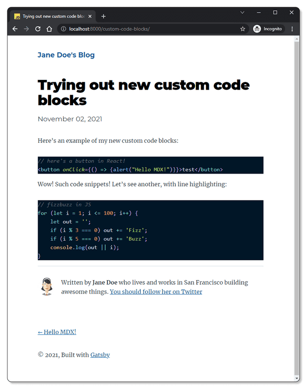
And here’s the final result from all that hard work:
Finished! 🎉
You’ve made it all the way to the end! Congrats! I hope you found this article useful - I tried to write the guide that I wish I had when I first started using MDX with Gatsby.
And if you use this to make your own custom code blocks, please reach out to me on Twitter and show me your work. I’d love to see your wonderful creation!
Additional Resources
I found the documentation for all the tools used in this project to be very well written and insightful. I recommend you give them a browse even if you didn’t run into any problems with this little project:
Also, I highly recommend Chris Biscardi’s Egghead videos and his blog posts about MDX. Lennart Jörgens Prince Wilson and Jim Raptis have also written similar articles on creating custom code blocks.
