How to Make Modern & Accessible Sidenotes for the Web
December 17, 2021
Sidenotes are a great communication tool for technical articles. It’s often useful for these types of articles to include little notes, disclaimers, tangents, examples or warnings that are easy to visually distinguish from the normal narrative flow. To meet this requirement, Markdown provides a syntax for footnotes. However, authors often opt for using the emphasis <em> element paired with a label (such as ‘note’, ‘warning’ etc):
Note: The following guide is written for web developers who have at least some basic knowledge of command-line, version control and a modern Javascript framework, preferably React.
There is widespread use of emphasis as a way to represent marginal information, since default footnotes don’t provide the immediate readability benefits of sidenotes. But it’s really not the way emphasis should be used: the <em> element is meant to indicate verbal stress on a few words, not entire sentences or paragraphs.
While we may have become accustomed to seeing this pattern accross the web, I think we owe it to our users to create better reading experiences.
Visual design, semantic elements and accessibility concerns
Gwern Branwen has written a great article about sidenotes in web design. In it, he looks at several modern-day implementations, including Bob Nystrom’s, who wrote one of the best resources on programming patterns since the Gang of Four. The issue with these more traditional approaches is that they are inherently desktop-first, and their mobile fallbacks are less enjoyable .
As consumers of technical articles, we’ve become accustomed to a more modern approach, which always places the sidenote in-flow, weather on desktop or mobile, and makes use of color and iconography to flag the content’s importance and set it apart from main content. When looking at such implementations across the web, you’ll notice that the term “sidenote” is becoming a bit of a misnomer. As a result, these elements are now commonly referred to as callouts, info boxes, asides, inline notifications etc.
Unfortunately there isn’t much consensus regarding the underlying semantic elements. Some developers choose to go with plain <div>s, while others use <aside>.
Even though the description in the MDN documentation on asides may not perfectly align with this use case, I think it’s more fitting than using a <div> (there is a note ARIA role available to flag this type of content, though it’s preferable to use semantic elements).
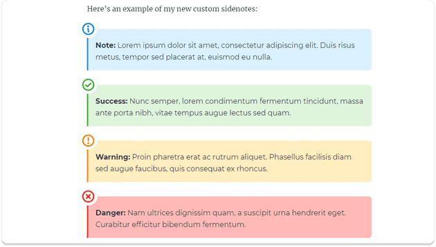
With MDX, you can create a custom React <NoteCard /> component to use whenever a sidenote is needed in an article. The component has four variants, one for each common use case for sidenotes: info, success, warning and danger:
Prerequisites
In this tutorial, the component we’re going to build is intended to be added to a project that’s been set up to use MDX. You can use MDX in any JSX runtime (React, Preact, Vue etc.). The guide here will be using Gatsby, which is built on React. The main concepts should be framework agnostic, so you’ll still get some value from reading to the end even if you’re not using Gatsby. If you want to learn how to make a Gatsby blog similiar to the one shown in this article and use it as a starting point for your own project, you can read about how I added MDX to an existing site in my previous article.
And if you’d like to poke around in the code as you read through this tutorial or after you’ve finished, take a look at the sandbox with the finished project.
Scaffolding the component
Create a new file in your components folder. I’ve named mine sidenote.js. Start with the usual boilerplate and create a basic component:
import React from "react";const SideNote = ({ children }) => (<aside style={{ color: "red" }}>{children}</aside>);export default SideNote;
To expose this component to all future posts, we need to add it to the <MDXProvider> components prop.
If you don’t have an application wrapper for your MDX documents, you can read about setting it up in the official MDX docs.
In Gatsby, this is done using the wrapRootElement API. Open the file where you’ve set up your MDXProvider and add the new SideNote component.
import React from "react";import { MDXProvider } from "@mdx-js/react";import SideNote from "./src/components/sidenote";const components = { SideNote };export const wrapRootElement = ({ element }) => {return <MDXProvider components={components}>{element}</MDXProvider>;};
Then, create a new mdx post or page to test out this new functionality.
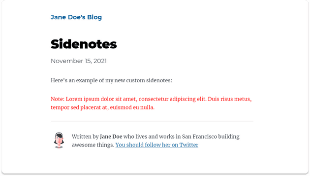
---title: Sidenotesdate: "2021-11-15"description: "Demo for new SideNotes component!"---Here's an example of my new custom sidenotes:<SideNote>Note: Lorem ipsum dolor sit amet, consectetur adipiscing elit. Duis risus metus, tempor sed placerat at, euismod eu nulla.</SideNote>
Your new component should render correctly on the test page:
Now that we have a basic component set up, we can add styling. We’ll start off with adding a pale colored background, a thin colored border on the left side, rounding the corners on the left and adjusting the spacing.
import React from "react";import styled from "styled-components";const SideNote = ({ children }) => <StyledAside>{children}</StyledAside>;const StyledAside = styled.aside`position: relative;margin-top: 2rem;margin-bottom: 1rem;padding: 1rem;padding-top: 24px;border-left: 3px solid #0e8de6;border-radius: 0px 6px 6px 0px;background-color: #dbf0ff;p {margin-bottom: 1rem;}*:last-child {margin-bottom: 0;}`;export default SideNote;
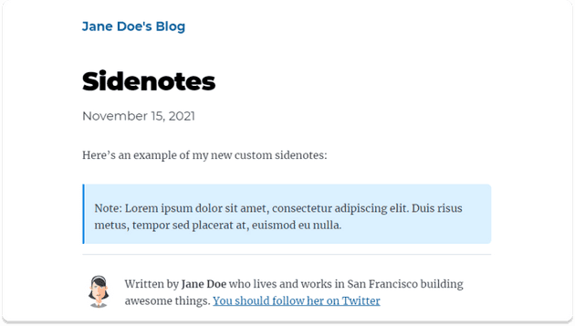
Here’s how the new styles transform the component:
Already that looks a lot better. We’ll work on variants in a bit, but first let’s add an icon to the sidenote. You can work with your favorite icon library, but in this example I’ll be using Phosphor icons.
npm install --save phosphor-react
It’s useful to create a wrapper component for your icons. Create a new file in your components folder called icon.js, then browse through the available icons and pick your favorite for your default, success, warning and danger sidenotes, then import them into the new component. Map these to labels that will get passed as a prop to the component.
import React from "react";import styled from "styled-components";import { Info, CheckCircle, WarningCircle, XCircle } from "phosphor-react";const icons = {info: Info,success: CheckCircle,warning: WarningCircle,danger: XCircle,};const Icon = ({ label, size = 32, weight = "bold", ...props }) => {const Component = icons[label];if (!Component) {throw new Error(`Icon not found - ID: ${label}`);}return (<Wrapper {...props}><Component color="currentColor" size={size} weight={weight} /></Wrapper>);};const Wrapper = styled.div`width: fit-content;padding: 4px;background-color: white;border-radius: 50%;& > svg {display: block;}`;export default Icon;
Then import the new icon component in your sidenote:
// ✂️ Other imports omitted for brevityimport Icon from "./icon";const SideNote = ({ children }) => (<StyledAside><Icon label="info" style={{ color: "#0e8de6" }} />{children}</StyledAside>);const IconWrapper = styled.div`position: absolute;top: 0;left: 0;transform: translate(-50%, -50%);`;// ✂️ Other styling omitted for brevity
Here’s how the base sidenote should look:
Now that the base component is finished, we can tackle the variants. Add a few more sidenotes to your test mdx file.
<!-- ✂️ Intro omitted for brevity --><SideNote variant={"success"}>**Success:** Nunc semper, lorem condimentum fermentum tincidunt, massa ante porta nibh, vitae tempus augue lectus sed quam. In egestas quam ut ipsum dictum consequat.</SideNote><SideNote variant={"warning"}>**Warning:** Proin pharetra erat ac rutrum aliquet. Phasellus facilisis diam sed augue faucibus, quis consequat ex rhoncus.</SideNote><SideNote variant={"danger"}>**Danger:** Nam ultrices dignissim quam, a suscipit urna hendrerit eget. Curabitur efficitur bibendum fermentum. Nulla pulvinar risus a accumsan viverra.</SideNote>
Then pass this prop to the icon component:
const SideNote = ({ variant = "info", children }) => (<StyledAside><IconWrapper><Icon label={variant} style={{ color: "#0e8de6" }} /></IconWrapper>{children}</StyledAside>);
With the correct icons now displaying for each variant, we just need to pass the right colors. For this tutorial we’ll set up a COLORS object to store our four different color pairs, but in a production site you’ll probably have these in a constants.js file.
const COLORS = {info: {color: "#0e8de6",backgroundColor: "#dbf0ff",},success: {color: "#37b635",backgroundColor: "#def5dc",},warning: {color: "#fb8400",backgroundColor: "#ffedbf",},danger: {color: "#fa2915",backgroundColor: "#ffbab8",},};
I’ve plucked these colors from Gatsby’s color guidelines page.
Now that we have the colors set up, we can pass them along as css variables through the style prop.
const SideNote = ({ variant = "info", children }) => {const style = {"--variant-color": COLORS[variant].color,"--background-color": COLORS[variant].backgroundColor,};return (<StyledAside style={style}><IconWrapper><Icon label={variant} /></IconWrapper>{children}</StyledAside>);};
Then, replace our placeholders in the StyledAside:
const StyledAside = styled.aside`position: relative;margin-top: 2rem;margin-bottom: 1rem;padding: 1rem;padding-top: 24px;border-left: 3px solid var(--variant-color);border-radius: 0px 6px 6px 0px;background-color: var(--background-color);p {margin-bottom: 1rem;}*:last-child {margin-bottom: 0;}`;
Finally, amend the custom Icon’s Wrapper to use our new color variable:
const Wrapper = styled.div`width: fit-content;padding: 4px;color: var(--variant-color);background-color: white;border-radius: 50%;& > svg {display: block;}`;
Here are the finished sidenote variants with their different styles:
Our sidenote component is visually complete, but there’s one aspect that still demands attention. Color and iconography communicates the role and importance of these text blocks to our sighted users, but will fall short for folks using screenreaders. To make sure our component is accessable, we need to add a label that’s available to those using assistive technology, but invisible to the rest. I’m going to include Josh Comeau’s VisuallyHidden snippet to tick this important box. Create a VisuallyHidden component following Josh’s instructions then import it into our sidenote file.
<StyledAside style={style}><IconWrapper><VisuallyHidden>{variant}</VisuallyHidden><Icon label={variant} /></IconWrapper>{children}</StyledAside>
Done 🎉
That wraps up our accessible sidenote component guide. I hope this will make your new posts a bit more fun to write now that you have another tool in your arsenal. If you ran into any problems, have a look at the code for this tutorial. And don’t forget to show me your new creations by tagging me on Twitter. 🚀


